A BRIEF HISTORY OF THE POSTMODERN REVOLUTION IN TYPOGRAPHY
Editorial Design
2022
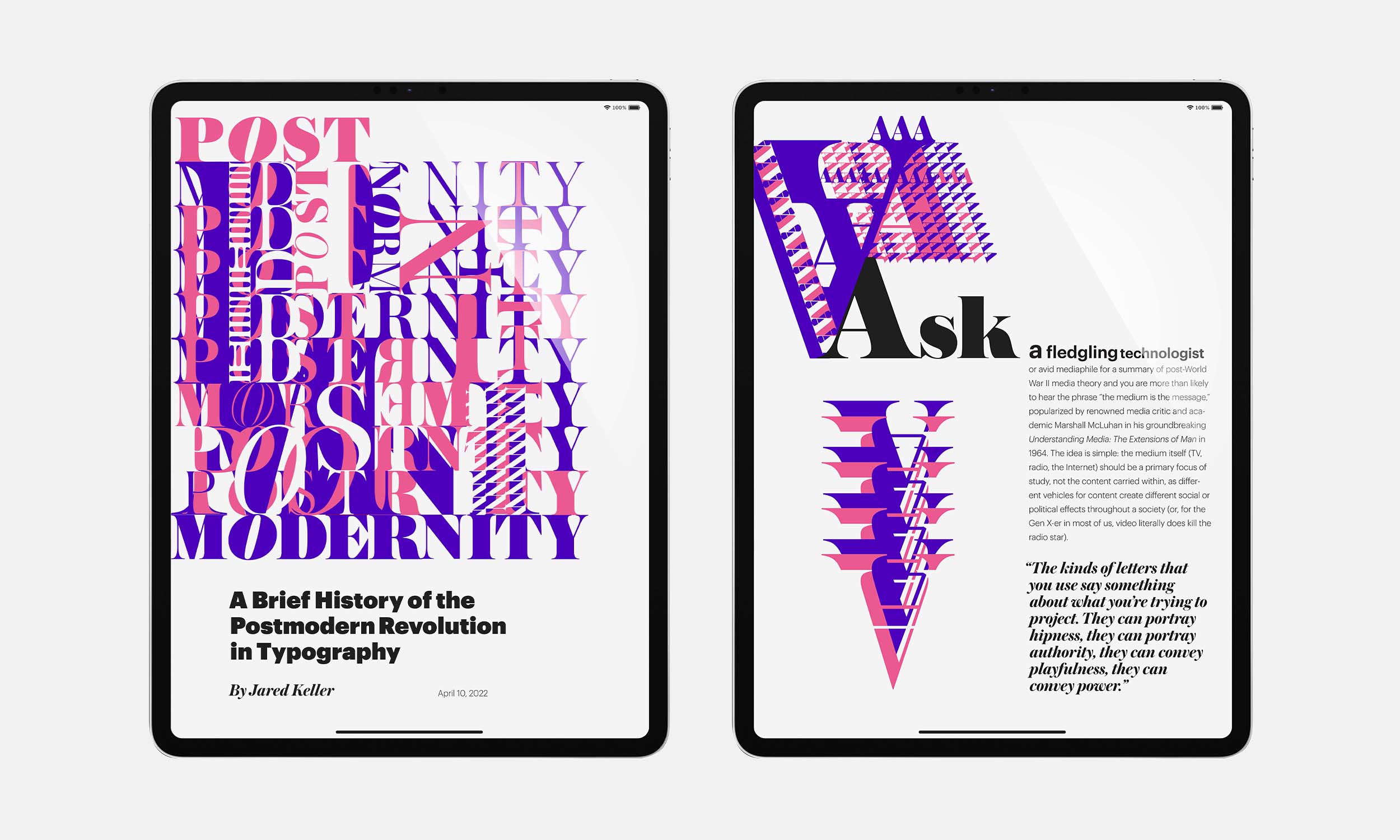
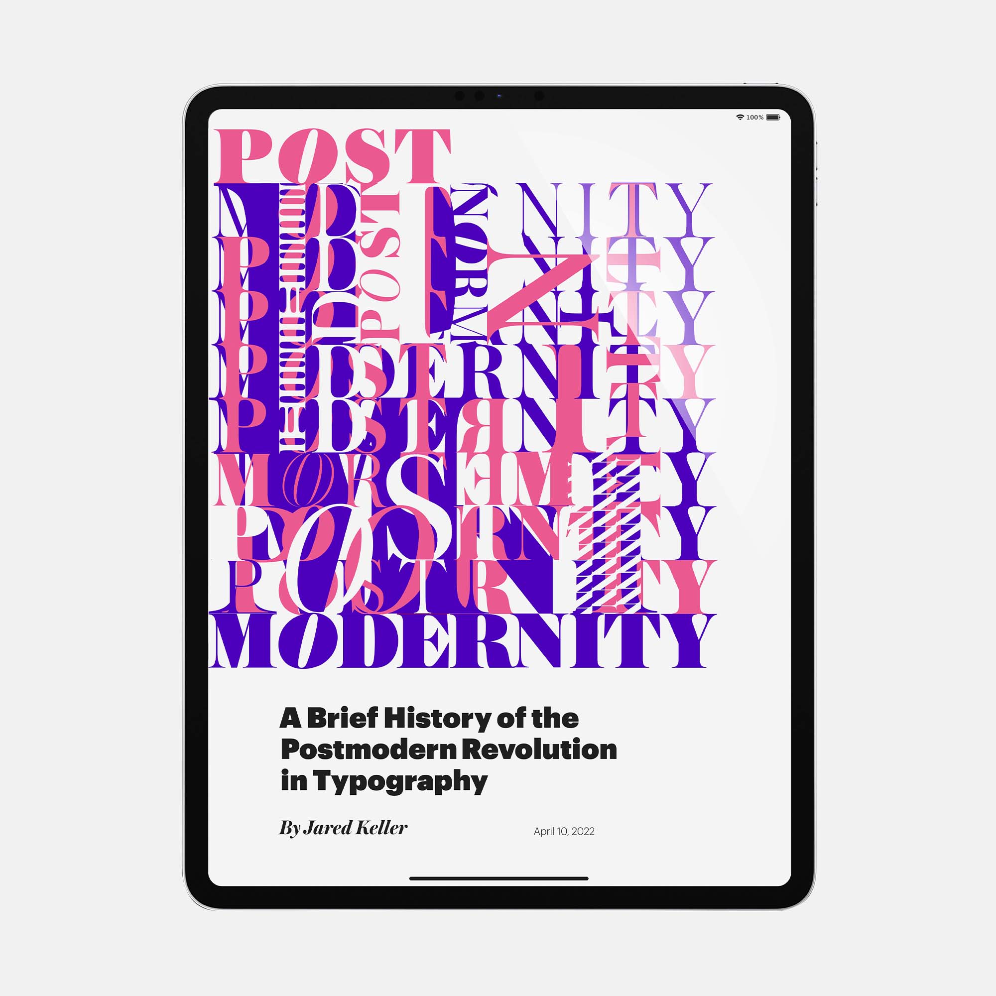
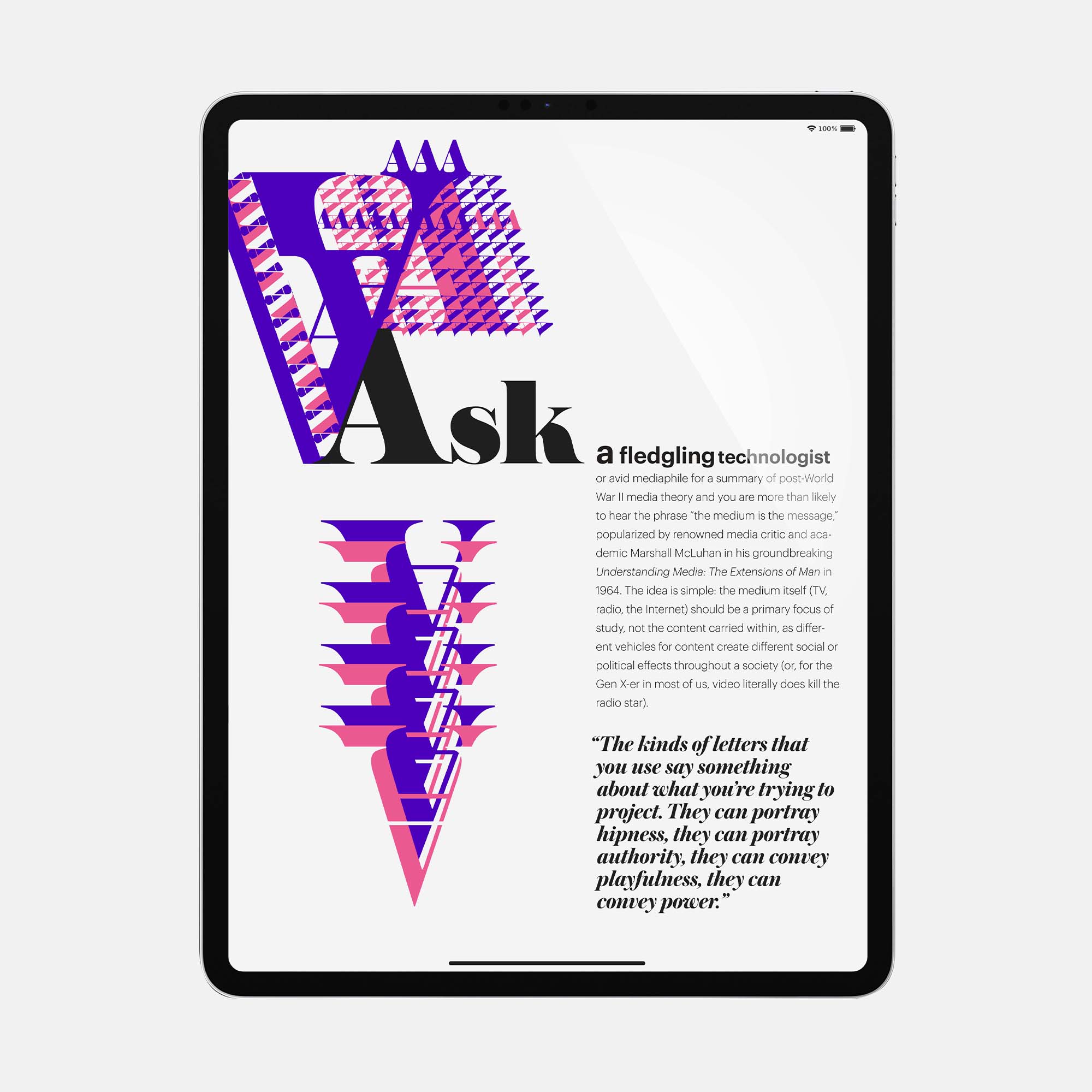
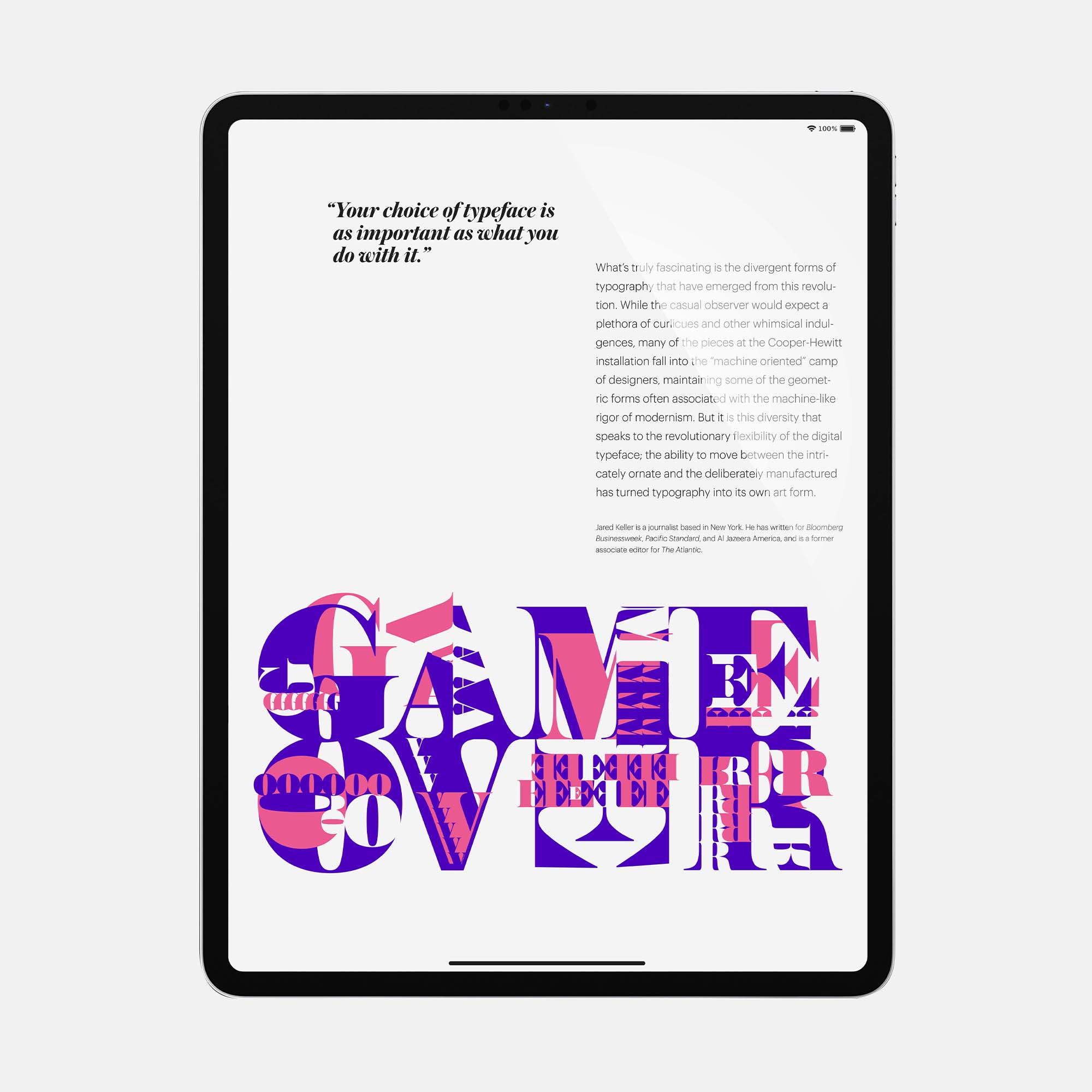
This digital editorial layout was an experiment in using type as image. The features in the modern serif typeface Austin presented a number of varying and exaggerated weights, shapes, and forms that were useful in conveying abstract illustration. By using the variety of negative and positive spaces this typeface provided, I felt I was able to convey and reinforce the message from the author by blurring the boundaries between the symbology and formal presence of these letter forms. In regard to color, I chose this pink and indigo dichotomy both for its vibrance and its contrast so I could provide something eye-catching while also granting myself more leeway in combining letters to make new shapes and forms.


